A new Android Auto update is finally making its way to consumer devices and we couldn’t be happier. Google originally claimed the update would hit automobile interfaces last summer, but that failed to pan out. To be clear, Google and Apple have extraordinary hoops to jump through when it comes to passing auto regulations in concern with visual displays. Let’s face it, the Federal Motor Vehicle Safety Standards board probably wants to make sure that folks are using the Google Tinder app while driving around town (and rightfully so).
Beyond that, another major hurdle is that auto display units don’t play well with mobile device operating systems like Android and IOS, so it can take a lot of resources to render them correctly in the display output.
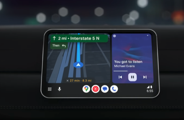
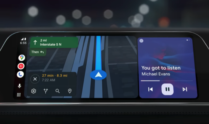
But alas, the upgrade has arrived and its pretty beefy. And Android’s new split screen update adapts to a variety of rectangular screens beyond the typical 16:9 display. For lack of a better term, the new Android split screen update adds a more elastic capability.

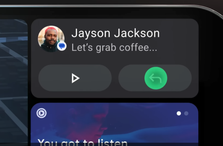
The most profound change involves the initial display which will show the main app interface, a navigation bar, and a more condensed sidebar that features more apps. You can customize all of this. You can move your nav bar from the right side to the bottom if you so enjoy.
Here’s a closer look:


Given the update is happening now, there’s no way to know how long the split screen auto update will take to reach all of us. Many Android users are frustrated that they have yet to see an update notification in the Google Play Store.
Now, there’s a big outlier question in this upgrade and that involves whether or not some automobile dashboards will require a manufacturer update. The good news is that most new cars update frequently.
Overall, we feel this is a great update that offers a vastly needed overhaul to Google’s mobile auto screen. Clearly, safety needs to be the first priority which often slows down this progress, but we can all live with that.


Comments closed.